A Beginner’s approach to Responsive Design

Passionate about crafting exceptional web experiences that merge creativity with functionality. Skilled in web design, development, UI/UX, graphic design, and small-scale video editing. Committed to creating user-centric designs and adhering to best practices, with a focus on sustainability and innovation.
If you’re reading this blog, let us assume you already have some basic knowledge and practical knowledge on how to structure your website using HTML and basic CSS.
In this blog, we’ll be covering some aspects of responsive design, why it is needed, and how to implement such a design.
What is Responsive Design?
Responsive Design is an approach where layouts become fluid and can automatically mold themselves according to the screen sizes and viewports.
It does not require any additional technology and can be implemented with the existing stylesheet.
In this blog, we’ll be talking about Responsive Web Design.
Responsive Web Design
Imagine a scenario — You’ve created an amazing website with great design ideas and good content. But that is limited to your computer screen only. The minute you take out your phone to test it, the design is all broken. There is a huge scroll or even unreadable content. No one wants to see that.
To give the most fulfilling client experience, you need to ensure that your site looks similarly great on screens of every kind. That is the reason why having a site with a responsive design is significant.
The facts confirm that most of the online traffic is coming from portable yet the work area is as yet a nearby second, and a responsive plan will assist you with defeating the two universes. It keeps up with the respectability of your site content yet adjusts it to deliver fittingly as per the points of interest of various gadgets, making it easier to understand.
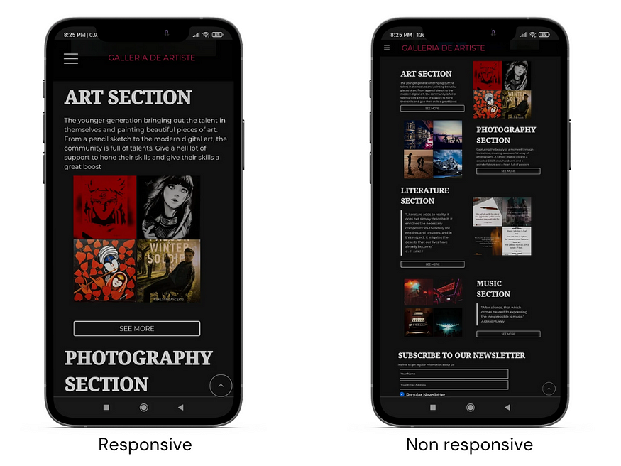
Fig: Representation of responsive vs non-responsive design.
website:www.galleria-de-artiste.netlify.app
How to implement Responsive Web Design(RWD)?
In this blog, we’ll talk about 5 ways to implement RWD.
1. using media queries
2. using flexbox
3. using grid
4. using relative units
5. using packages/frameworks/libraries
Media Queries:
Media queries allow developers to apply CSS styles depending on a device’s general type (such as print vs. screen) or other characteristics such as screen resolution or browser viewport width. Media queries are used for the following:
· To conditionally apply styles with the CSS @media and @import at-rules.
· To target specific media for the <style>, <link>, <source>, and other HTML elements with the media= attribute.
· To test and monitor media states using the Window.matchMedia() and MediaQueryList.addListener() JavaScript methods.
A media query is composed of an optional media type and any number of media feature expressions, which may optionally be combined in various ways using logical operators. Media queries are case-insensitive.
A common approach when using Media Queries is to create a simple single-column layout for narrow-screen devices (e.g. smartphones), then check for wider screens and implement a multiple-column layout when you know that you have enough screen width to handle it. Designing for mobile first is known as mobile-first design.
Media type includes: all, screen, print (default is all)
To begin with, you can simply start by writing the syntax as such:
@media {}
Since this is a beginner's guide, let's focus on using the screen as a media type only.
We can specify some targeted features, i.e. we can specify some particular device width for which the designs will be different.
h1 {
font-size: 50px;
}
@media (max-width:480px)
{
 h1 {
    font-size:20px;
    }
}
In this snippet, 50px is applied to the h1 tag across all screens. However, whenever the device width is less than 480px (generally considered for small screens such as smartphones), the font size for all h1 tags would become 20px.
Combining multiple types or features:
The and keyword combines a media feature with a media type or other media features. This example combines a media type screen and two media features to restrict styles to portrait-oriented devices with a width of at most 480px:
h1 {
font-size: 50px;
}
@media screen and (max-width:480px) and (orientation:potrait)
{
 h1 {
    font-size:20px ;
    }
}
Testing for multiple queries
You can use a comma-separated list to apply styles when the user’s device matches any one of various media types, features, or states. For instance, the following query will apply styles if the user’s device has either a minimum height of 780px or is a screen device in portrait mode:
h1 {
font-size: 50px;
}
@media (min-height:780px), screen and (orientation:potrait)
{
 h1 {
    font-size:20px ;
    }
}
Flexbox:
Flex layout offers a row/column-based one-dimensional layout where the items can flex(expand) or shrink based on layout requirements.
According to the available space in their container, flex elements in Flexbox can grow or shrink, redistributing space between them as necessary. You may specify how you want the objects to react when they meet more or less space by adjusting the values for flex-grow and flex-shrink.
The following example shows the container to occupy the entire width available based on the space. The children are distributed in a 1:2:1 ratio of width.
If you’re new to Flexbox, I suggest reading about it from here.
.container
{
flex: 1;
}
.child1,.child3
{
flex: 1;
}
.child2
{
flex:2;
}
CSS Grid:
In CSS Grid Layout the fr unit allows the distribution of available space across grid tracks. This example creates a grid container with three tracks sized at 1fr. This will create three column tracks, each taking one part of the available space in the container.
.container {
display: grid;
grid-template-columns: 1fr 1fr 1fr;
}
The alignment can be changed to rows by simply replacing grid-template-columns with grid-template-rows.
If you’re not familiar with the layout and structure of a grid, it’s recommended to learn more about it from here.
Using relative units
While mentioning sizes, we generally should avoid the use of absolute units like px, pt, etc.
Rather, the usage of relative units such as %,vw,vh,em,rem should be encouraged to increase responsiveness with minimal amounts of code redundancy.
Here are the relative units and their definitions, sourced from https://developer.mozilla.org/en-US/docs/Learn/CSS/Building_blocks/Values_and_units
em : Font size of the parent, in the case of typographical properties like font-size, and font size of the element itself, in the case of other properties like width.
ex: x-height of the element’s font.
ch : The advance measure (width) of the glyph “0” of the element’s font.
rem: Font size of the root element.
lh: Line height of the element.
rlh: Line height of the root element. When used on the font-size or line-height properties of the root element, it refers to the properties’ initial value.
vw: 1% of the viewport’s width.
vh: 1% of the viewport’s height.
vmin: 1% of the viewport’s smaller dimension.
vmax: 1% of the viewport’s larger dimension.
vb: 1% of the size of the initial containing block in the direction of the root element’s block axis.
vi: 1% of the size of the initial containing block in the direction of the root element’s inline axis.
svw, svh: 1% of the small viewport’s width and height, respectively.
lvw, lvh : 1% of the large viewport’s width and height, respectively.
dvw, dvh: 1% of the dynamic viewport’s width and height, respectively.
An example might clear out any doubts about the usage of these units.
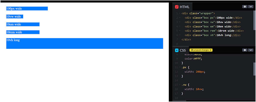
.wrapper {
    font-size: lem;
}
.box
{
    background: #007bff ;
    margin:20px;
    width: auto;
    color:#fff;
}
.px {
    width: 200px;
}
.vw {
    width: 10vw;
}
.em {
    width: 10em;
}
.rem {
    width: 10rem;
}
.vh {
    height:l0vh;
}
Using frameworks/libraries/packages
Several libraries like Bootstrap or Tailwind have predefined class names that enable the usage of responsive design.
<!-- tailwind css !-->
<div class="w-96 bg-white shadow rounded">
    w-96
</div>
<!-- bootstrap css !-->
<div class="row">
    <div class="col-md-6">
        col-md-6
    </div>
</div>
You can explore more on these on the official docs of Bootstrap and Tailwind.
Summary
A website or application that adapts to the environment in which it is viewed is said to have a responsive design. It includes many CSS and HTML capabilities and approaches and is now practically the only way we create webpages.
With the aid of the layout techniques you have learned in these classes, it has also become much simpler to create responsive designs. Today, web developers have access to a far wider range of tools than they had in the early days of responsive design. Even while the older tutorials are still helpful, it is far simpler to develop beautiful and practical designs using contemporary CSS and HTML, regardless of the device a visitor is using to access the website.


